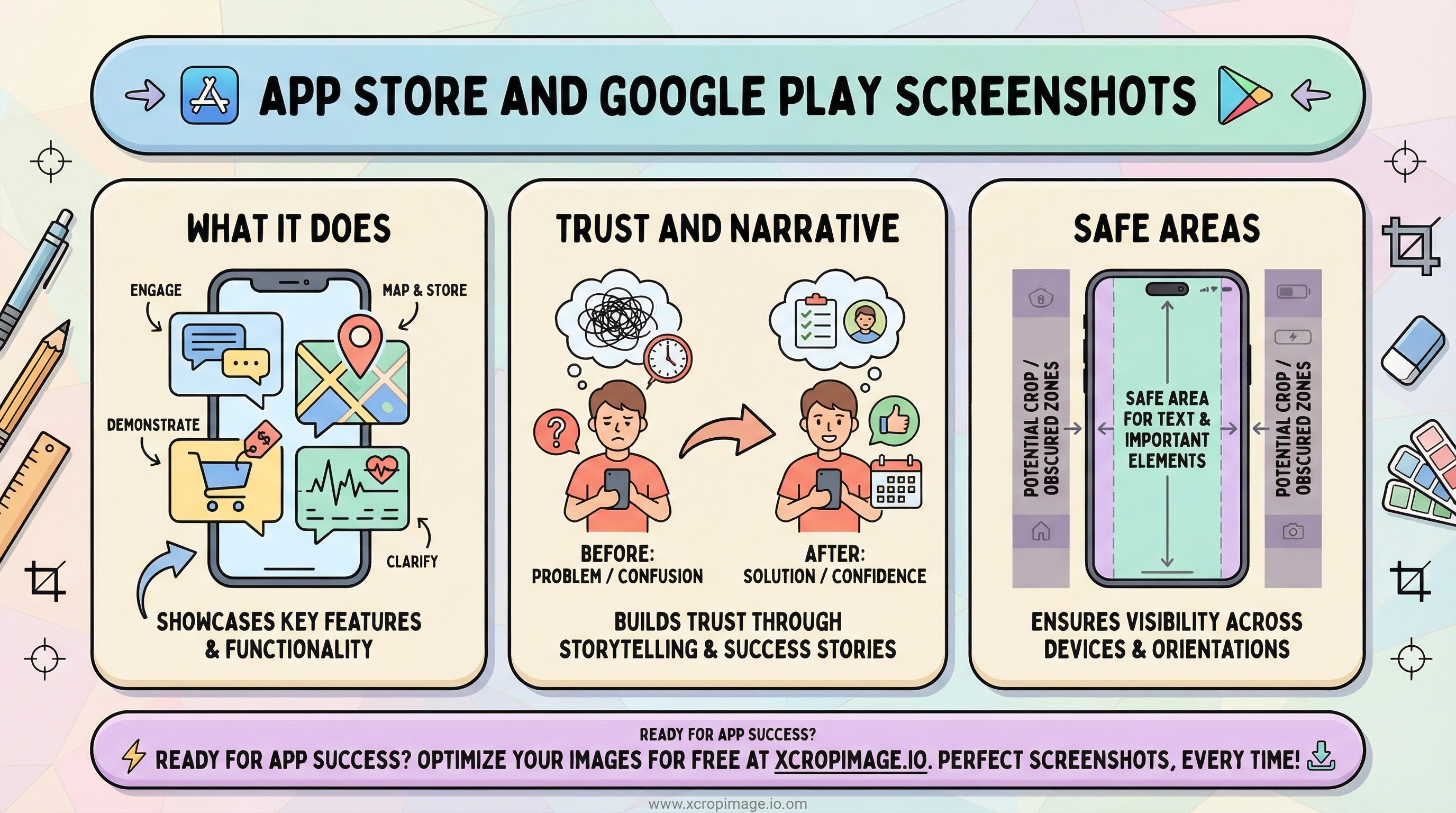
App Store and Google Play screenshots: layout for trust and feature emphasis
Plan screenshot order, safe text areas, and consistent framing to improve conversion in app stores.
Introduction
Screenshots strongly influence installs. Readable copy, consistent framing, and feature order are part of ASO—not only polished UI captures. This article ties official specs to a simple narrative structure, safe text placement, and production habits that keep listings maintainable across releases.
Earlier in this series: PWA splash and icons · OG previews · Newsletter heroes.
Official specs
- Check Apple’s screenshot specifications and Google Play’s graphic assets for current sizes before each release—requirements change with device classes and store UI.
- Keep framing consistent within one listing: either device chrome or flat UI captures, not a random mix.
Story order and trust
| Slot | Goal |
|---|---|
| First screenshot | Answer what the app does in one glance |
| Middle set | One clear benefit per frame—avoid tiny paragraphs |
| Closing frames | Proof (reviews, metrics), integrations, or privacy/support |
Social proof can echo a story similar to before/after image series; keep claims verifiable.
Safe areas and legibility
- Place headlines inside safe areas so previews on small phones do not crop your copy. Our guide on vertical safe areas applies to marketing frames too.
- Thin fonts and low contrast fail at thumbnail size—test exports at actual store preview scale.
Production workflow
Fit raw captures with crop, then resize to required dimensions. For promo thumbnails outside the store, YouTube thumbnail tips align with message-density skills. Turkish readers can follow the parallel post: App Store ve Google Play ekran görüntüleri.
Conclusion
Treat screenshots as a short story plus spec-compliant assets. Consistency across frames reduces cognitive load and makes updates cheaper when you ship new features.