Before/After Image Series: How to Increase Visual Impact
A practical checklist for creating before/after image series that clearly show the transformation and build trust.
Introduction
Before/after image series are powerful because they make improvement visible. But they fail when the comparison is unclear—different angles, inconsistent lighting, or inconsistent framing can make the “after” look like a different product.
Use this checklist to create clear before/after visuals that look honest and professional. For consistent framing, use crop and resizer on xcropimage.io.
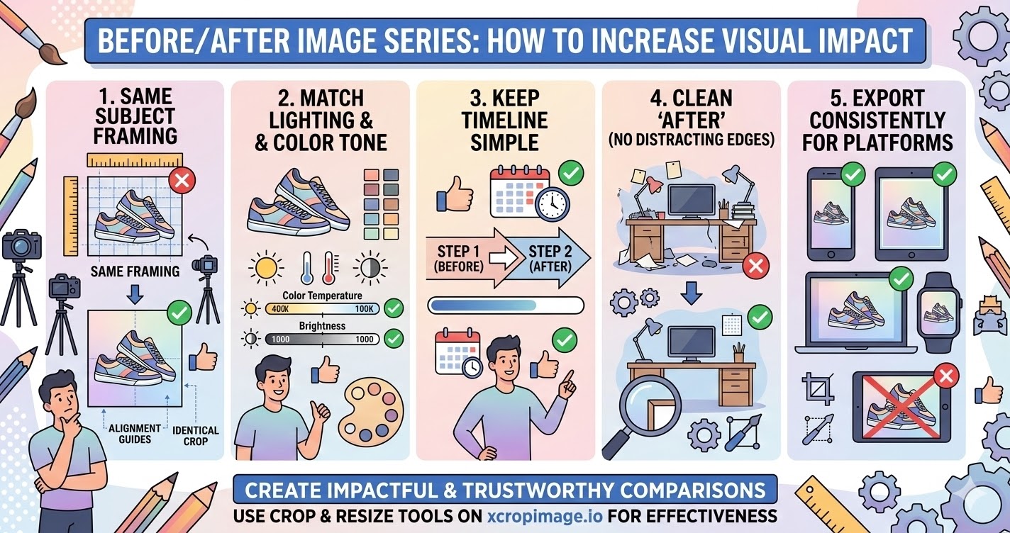
1. Use the same subject framing in both shots
The biggest rule: the product/area should be framed the same way in before and after.
When people see the same framing, the mind attributes the difference to the result—not to camera changes.
2. Match lighting and color tone
If lighting changes between the shots, colors can shift and the result looks less credible.
Work to keep the overall color temperature and brightness as close as possible.
3. Keep the timeline simple (sequence clearly)
Your viewer should understand the story instantly: before first, after second (or “step 1 → step 2”).
Avoid adding too many extra images unless they add real clarity.
4. Make the “after” look clean (no distracting edges)
The after image should feel crisp and intentional. Any leftover edge artifacts or inconsistent crops reduce trust.
Crop distractions out and standardize output dimensions using the resizer.
5. Export consistently for the platform you post on
Different platforms crop differently. If you export without matching the platform ratio, the after may cut off key details.
Prepare platform-safe framing with crop and resizer so the comparison stays clear.
Conclusion
Impactful before/after visuals come from five checks: same framing, matched lighting/color, clear sequence, clean and distraction-free after, and consistent exports. Use the crop and resize tools on xcropimage.io to create comparison images that look trustworthy and effective.