Effective Visual Usage in Campaign Announcements
How to use visuals effectively in campaign announcements to maximize reach and engagement. Practical tips on image design, sizing, and consistency.
Introduction
A campaign announcement is only as strong as the visual that carries it. Whether you are announcing a sale, a product launch, or a limited-time offer, the image is what stops the scroll and communicates urgency and value before a single word is read. This post shares practical tips for using visuals effectively in campaign announcements across social media and email. You can use the tools on the xcropimage.io homepage to crop and resize your announcement images for every platform.
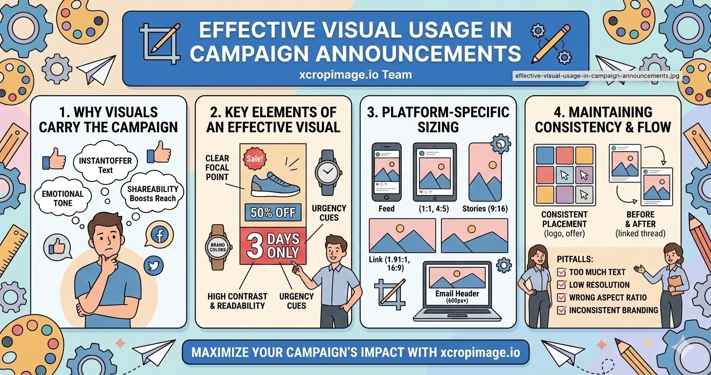
Why the Visual Carries the Campaign
- Instant communication: A well-designed campaign image communicates the offer—sale percentage, new product, event date—in under two seconds, before the audience reads the caption.
- Emotional trigger: Color, contrast, and imagery set the emotional tone of a campaign (excitement, exclusivity, urgency) before the copy reinforces it.
- Shareability: Eye-catching campaign visuals get shared and saved far more than text-heavy posts; an image that looks worth sharing extends your organic reach at no extra cost.
The visual is not decoration for the announcement—it is the announcement.
Key Elements of an Effective Campaign Visual
- Clear focal point: One main message per image—discount percentage, product name, or event date. Trying to say everything in one image says nothing clearly.
- High contrast and readability: Text on campaign images must be legible at a glance; use high-contrast color combinations (dark text on light background or the reverse) and a large, bold font.
- Brand colors and logo: Anchor the campaign visual to your brand so it is recognizable even when shared out of context; include your logo in a consistent corner position.
- Urgency cues: Countdown labels ("3 days only," "ends Sunday") or bold sale callouts ("50% OFF") placed visibly on the image reinforce the call to action.
Platform-Specific Sizing for Announcements
Campaign visuals must be prepared in multiple sizes to look right everywhere:
- Instagram / Facebook feed: Square (1:1) or portrait (4:5)—portrait takes more screen space and tends to perform better for campaign posts.
- Instagram / Facebook Stories: Full vertical (9:16); use this for countdown stickers and swipe-up links.
- Twitter/X and LinkedIn: Landscape (1.91:1 or 16:9) for link previews and promoted posts.
- Email header: Typically 600–700 px wide; aspect ratio varies by template but 2:1 is common.
Use the crop tool to reframe a single master image into all required sizes without reshooting or redesigning from scratch. The resizer helps you hit exact pixel dimensions fast.
Consistency Across the Campaign
- Same visual family: All images in a campaign—feed posts, stories, email banner, ad creative—should share the same color scheme, font, and graphic style so the campaign feels unified across touchpoints.
- Consistent placement: Keep the logo, offer text, and call to action in the same position across all sizes; audiences scanning quickly need to find information in the same place every time.
- Before and after: If the campaign runs over multiple days, use a consistent visual thread (same background color or graphic element) to link all posts so they feel like a series.
What to Avoid
- Too much text: Platforms like Facebook penalize image ads with too much text; keep the copy in the caption and use the image for impact, not information delivery.
- Low-resolution images: A blurry or pixelated campaign image undermines credibility right at the moment you are asking customers to trust you with a purchase.
- Wrong aspect ratio: An awkwardly cropped campaign image that cuts off the offer text or brand name damages the announcement before it is even read. Use the crop tool to prevent this.
- Inconsistent branding: Using different colors or fonts across campaign assets makes the promotion look unplanned and reduces trust.
Practical Workflow for Campaign Visuals
- Design the master campaign image at a large size (e.g. 2400 × 2400 px square) with all elements inside a safe zone.
- Use the crop tool to export platform-specific crops (1:1, 4:5, 9:16, 1.91:1) without redesigning.
- Use the resizer to hit each platform's recommended pixel dimensions.
- Keep file sizes manageable—under 1 MB for social, under 200 KB for email—so everything loads fast.
Conclusion
Effective campaign visuals are clear, bold, on-brand, and sized correctly for every platform. They communicate the offer at a glance, trigger the right emotion, and reinforce trust. Use the crop and resize tools on xcropimage.io to turn a single campaign image into all the platform-ready sizes you need—quickly and consistently.