Emotional Triggers in Product Photos: Color and Composition Patterns That Influence Purchase
Use color and composition intentionally to shape buyer perception and improve product page performance.
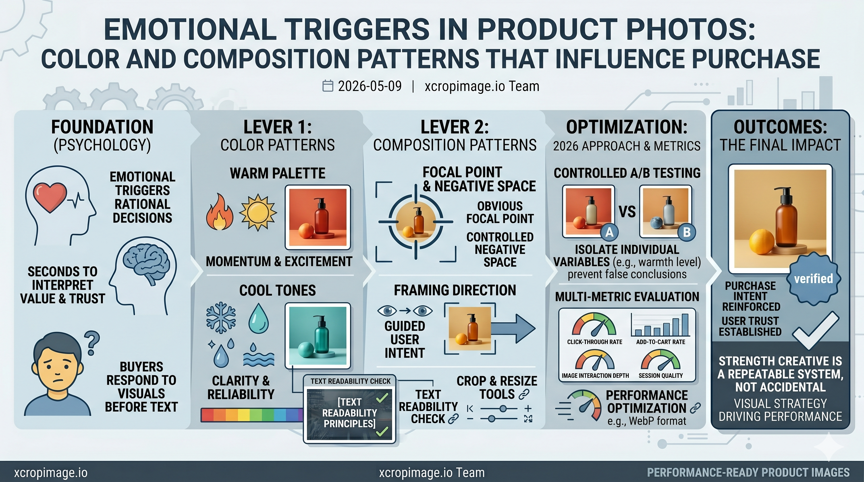
Buying decisions are often emotional before they become rational. Color temperature, contrast hierarchy, and framing direction influence how users interpret value, trust, and urgency within seconds.
Warm palettes can suggest momentum and excitement, while cooler tones support clarity and reliability. Composition matters just as much: when the focal point is obvious and negative space is controlled, users process the offer faster.
To maintain readability in overlays, apply principles from text readability in ad images. Then test crop behavior across placements with the image cropper and standardize output sizes using the image resizer.
Performance should support psychology. Use modern compression practices from WebP format advantages so visual quality remains high without slowing load speed.
Strong creative is not accidental. It is a repeatable system where color, focus, and layout reinforce the same buying intent.
2026 Testing Approach
Run controlled A/B tests where only one emotional variable changes at a time, such as warmth level, negative space, or focal distance. This isolates impact and prevents false conclusions from mixed creative changes.
Better Metrics for Creative Decisions
Track click-through rate together with add-to-cart rate, image interaction depth, and session quality metrics. A visual can win clicks but lose buying intent; multi-metric evaluation prevents that trap.