LinkedIn article and event covers: text safe zones and layout
Plan LinkedIn article and event cover images with safe zones for headlines and logos across desktop and mobile.
Introduction
Article and event covers on LinkedIn crop differently in the feed versus detail views—and mobile can trim edges further. Without a safe zone, headlines and logos get clipped and campaigns look inconsistent. This article covers sizing discipline, brand alignment, and a simple production workflow.
Earlier in this series: App Store screenshots · PWA splash · OG previews.
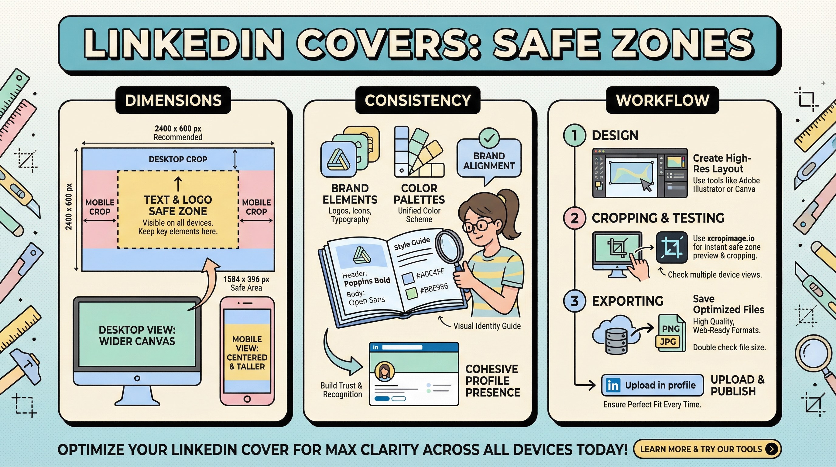
Dimensions and safe area
LinkedIn updates recommended sizes periodically—check the LinkedIn Marketing Solutions help center before publishing. General rules:
- Keep critical text and logos inside a center-weighted safe rectangle; leave padding from top, bottom, and sides.
- The logic in our vertical safe area guide applies here too.
- If you reuse one master across article, event, and ads, preview each crop—not all surfaces use the same mask.
B2B consistency
Align covers with profile and company visuals; see visual usage for brand identity. When links are shared, validate previews with Open Graph debugging.
Workflow
- Design at high resolution with guides for safe margins.
- Test exports with crop across aspect ratios.
- Export final pixels with resize to match current LinkedIn specs.
Turkish parallel
LinkedIn makale ve etkinlik kapakları mirrors this article in Turkish.
Conclusion
Treat LinkedIn covers as multi-crop assets: center your message, respect safe zones, and re-verify whenever LinkedIn updates layout guidance.