Premium Product Presentation: Lighting and Framing Strategies That Elevate Price Perception
Improve perceived product value with practical lighting, composition, and consistency techniques for premium-looking visuals.
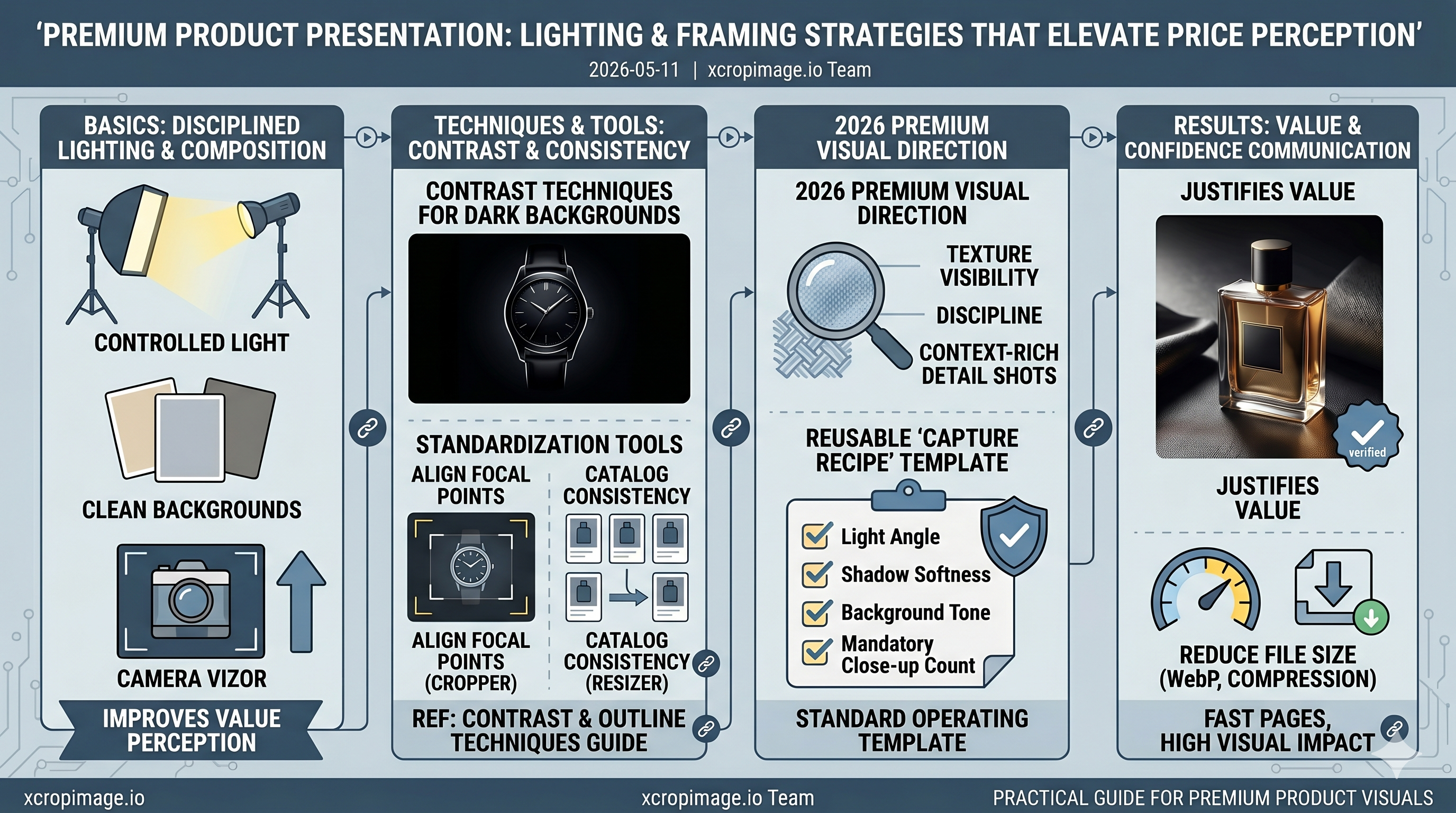
Price perception is often formed before users read product details. If visuals feel inconsistent or low control, even high-quality products can appear average.
A premium look usually comes from disciplined basics: controlled light, clean backgrounds, and intentional framing. For dark setups, apply methods from contrast and outline techniques for dark backgrounds.
Standardization is critical at scale. Align focal points with the image cropper, then maintain catalog consistency through the image resizer. This makes product lists feel curated instead of mixed.
To keep pages fast without sacrificing visual impact, apply compression principles from reduce file size without lowering quality.
Premium visuals are not about expensive production alone. They are about repeatable quality signals that communicate confidence and justify value.
2026 Premium Visual Direction
Current premium brands are reducing heavy filters and focusing on controlled realism. Texture visibility, lighting discipline, and context-rich detail shots now influence value perception more than over-stylized effects.
Implementation Framework
Build a reusable "premium capture recipe" per category: light angle, shadow softness, background tone, and mandatory close-up count. Turning this into a standard operating template keeps quality consistent across teams and production cycles.