Using Contrast and Outlines for Products on Dark Backgrounds
A practical checklist for making product cutouts and outlines look clean and natural on dark backgrounds using contrast and edge control.
Introduction
Dark backgrounds can look premium, but they also create a problem: edges can disappear, and cutouts can look like they have a rough halo. If you are selling online, that lack of clarity reduces trust.
This guide shares five checks to use contrast and outlines correctly for products on dark backgrounds. You can use the crop tool and resizer on xcropimage.io to keep framing and exports clean and consistent.
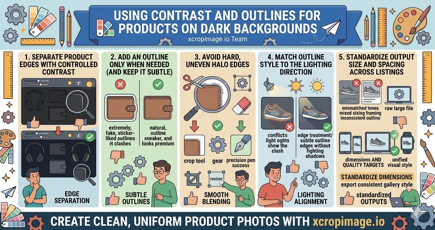
1. Separate product edges with controlled contrast
When the product and background are too close in tone, the viewer loses the boundary.
Use contrast so the product stands out—either by adjusting background tone or by fine-tuning the edge brightness.
2. Add an outline only when needed (and keep it subtle)
An outline should help the viewer read the shape, not look like a sticker.
Choose a thin outline and keep it consistent across the catalog so it becomes part of your visual identity.
3. Avoid hard, uneven halo edges
Uneven blending around the cutout creates a visible halo.
Use clean edges: you can remove leftover edge clutter with the crop tool and check the shape at 100% view before export.
4. Match outline style to the lighting direction
If your product appears lit from one direction, your edge treatment should feel consistent with that lighting.
Keep the outline’s glow/brightness aligned so it does not “fight” the shadows.
5. Standardize output size and spacing across listings
Even a correct outline can look different if each image is exported with different sizing or padding.
Use the resizer to standardize dimensions, and export all products in a consistent gallery style.
Conclusion
Products on dark backgrounds look professional when you handle five things: edge separation with contrast, subtle outlines, smooth blending without halos, lighting-consistent edge styling, and standardized exports. Use the crop and resize tools on xcropimage.io to keep your dark-background catalog clean and trustworthy.