Visual accessibility beyond alt text: contrast, layers, and focus order
Alt text is necessary but not sufficient—pair it with contrast, keyboard focus, and motion safety.
Introduction
Alt text helps SEO and screen readers, but contrast, focus order, motion, and how text relates to images complete the picture. Treat accessibility as a system: markup, design, and content decisions together—not a checkbox after export.
Earlier in this series: Panoramic cropping · Short video vs GIF · Ad readability.
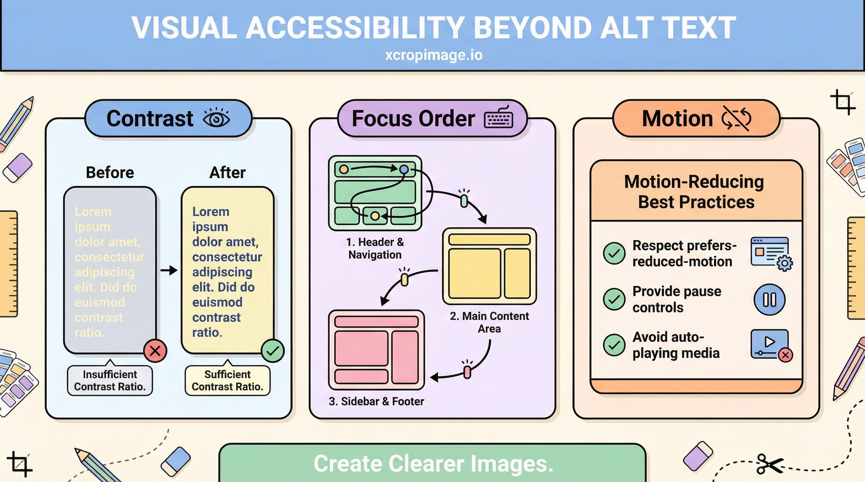
WCAG essentials
Read WCAG 2.2 for contrast, focus visibility, and motion-related criteria. Test contrast pairs with WebAIM’s checker. Remember that “large text” thresholds differ from body copy—size your headlines accordingly.
Text baked into images
When marketing copy lives inside a bitmap, screen readers and zoom users suffer unless you:
- Repeat the same message in real HTML text, or
- Provide a concise alt that captures the full intent (not “banner image”).
Align text/image hierarchy with why visuals matter in social ads. For typography-on-image craft, see ad image readability.
Motion and distraction
Autoplay video, parallax, and looping animations can trigger vestibular issues. Offer prefers-reduced-motion respect, pause controls, and avoid flashing above common seizure-safety thresholds.
SEO pairing
Pair with alt text SEO. Text-heavy email branding appears in newsletters without images.
Turkish parallel
Görsel erişilebilirlik (Türkçe) mirrors this article.
Conclusion
Accessibility is not “alt text only”—it is contrast, semantics, keyboard paths, and motion policy working together.