Visual Usage Guide to Strengthen Your Brand Identity
A practical visual usage guide for strengthening your brand identity. Colors, typography, image style, consistency, and platform-specific tips.
Introduction
Brand identity is not just a logo—it is everything your audience sees: colors, image style, typography, and the overall visual language your brand uses consistently. A strong visual identity makes your brand instantly recognizable, builds trust, and makes marketing more effective over time. This guide covers practical steps to define and maintain a visual style that strengthens your brand across all platforms. You can use the tools on the xcropimage.io homepage to crop and resize your images for a consistent look everywhere.
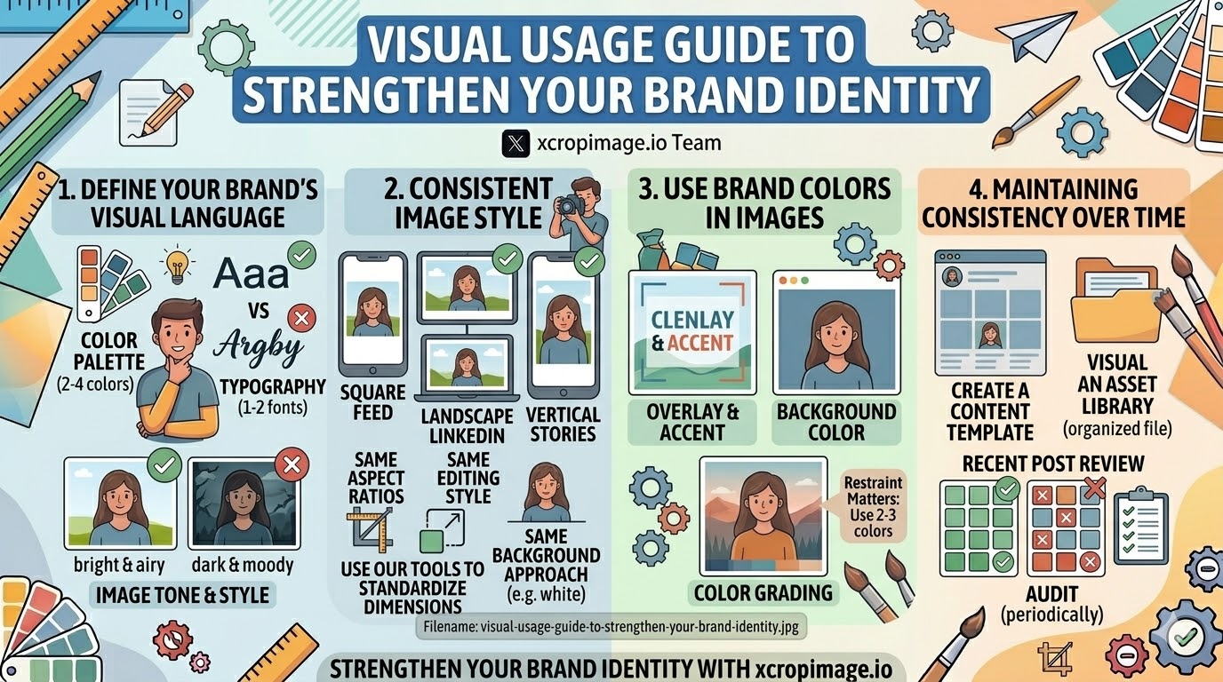
Define Your Brand's Visual Language
Before producing any content, establish the core visual elements your brand will use consistently:
- Color palette: Choose 2–4 primary brand colors and stick to them. Consistent colors across posts, ads, and website create instant recognition.
- Typography: Select 1–2 fonts that match your brand's personality (e.g. clean sans-serif for modern/minimal, serif for classic/premium). Use the same fonts on all graphics.
- Image tone and style: Decide on a photographic style—bright and airy, dark and moody, warm and natural, clean and minimal. This creates cohesion even when images come from different sources.
Documenting these choices in a simple brand guide (even a single reference document) prevents inconsistency as your team or content volume grows.
Consistent Image Style Across Platforms
- Same aspect ratios: Use consistent crops for each platform type—square for Instagram feed, landscape for LinkedIn, vertical for stories. The crop tool makes it fast to prepare platform-specific versions from a single source image.
- Same editing style: Whether you use warm tones, cool tones, or high contrast, apply the same treatment consistently; audiences begin to recognize your images before they even see your name.
- Same background approach: If your brand uses white backgrounds for product shots, use them across all listings and profiles—not only some.
Use the resizer to standardize dimensions and ensure every image fits its intended placement perfectly.
How to Use Brand Colors in Images
- Overlay and accent: Use brand colors as text overlays, borders, or graphic accents on images to tie them together visually.
- Background color: A consistent colored background (even a simple solid color) instantly makes images recognizable as part of your brand.
- Color grading: Photo editing that shifts tones toward your brand's color palette creates a cohesive feed even with varied content.
Restraint matters: two or three colors used consistently outperform a rainbow of occasionally used shades.
Imagery That Reflects Brand Values
- Choose subjects that align with your message: A sustainable brand should use natural, earthy imagery; a tech brand benefits from clean, modern photography.
- People and representation: If you use people in imagery, make sure the diversity and style reflects your brand's values and target audience.
- Avoid generic stock: Overly polished, obviously staged stock images feel detached; authentic, brand-specific photography (even with a smartphone) often performs better.
Maintaining Consistency Over Time
- Create a content template: A simple template for social posts (consistent placement of logo, consistent text area, consistent image area) saves time and ensures consistency.
- Build a visual asset library: Store correctly cropped and resized images in one organized location so the right version is always ready to use.
- Audit periodically: Every few months, review recent posts side by side. If they look inconsistent, identify which elements have drifted and bring them back in line.
What to Avoid
- Using too many styles at once: Multiple visual styles in the same feed confuse the audience and dilute brand recognition.
- Inconsistent image quality: Mixing high-quality photos with low-quality or blurry ones makes the brand look careless.
- Ignoring platform differences: The same image often needs different crops for different platforms; uploading without adapting leads to bad auto-crops. Use the crop tool to prepare correctly for each one.
Conclusion
A strong brand identity is built through consistent, intentional visual choices—colors, style, format, and quality applied the same way across every touchpoint. Use the crop and resize tools on xcropimage.io to maintain consistent image dimensions and framing across all platforms, and let your visual identity do the work of building recognition and trust for your brand.