Ecommerce category visual consistency across supplier photos
Align backgrounds, crops, and color so multi-supplier catalogs look cohesive in grids and lists.
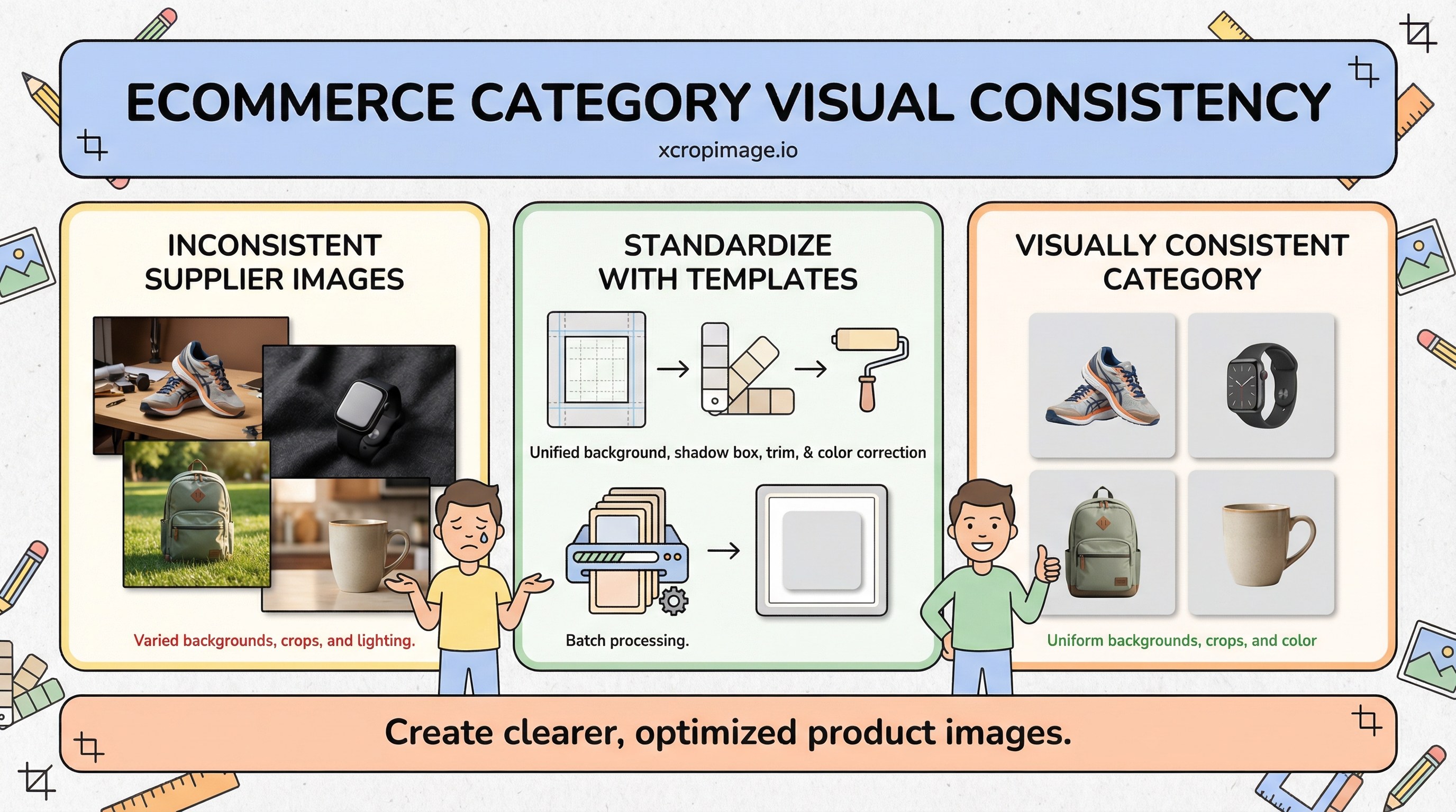
Introduction
Supplier photos arrive with mixed backgrounds, aspect ratios, and white balance, making category grids look noisy. Shoppers scan faster when tiles feel like one system—without losing product truth. This article covers a single template, color correction, and how to operationalize fixes at scale.
Earlier in this series: Product image A/B tests · Collection grid sizing · Color consistency.
One template to rule the grid
Define one background treatment (pure white, light gray, or brand-approved tone), shadow rules, and trim—then apply everywhere. Produce repeatable outputs via batch workflow so new SKUs don’t reintroduce chaos.
Square versus portrait: pick one per category; mixing breaks alignment on mobile.
Color correction
When suppliers deliver RAW or high-quality JPEG, batch white balance and mild exposure correction. See RAW vs JPEG workflow for capture-side discipline; if you only receive small JPEGs, be conservative—heavy correction increases noise.
Cropping and resolution
Lock crops with resize and crop so the product occupies a similar visual area in every tile—tiny products floating in huge frames look inconsistent.
Brand alignment
Align with brand identity visuals; for Turkish-language operations, see E-ticaret kategori tutarlılığı.
Conclusion
Consistency is a system, not a one-off Photoshop session. Document the template, automate where possible, and review grids on real phones—not only desktop.